Configuration
You can configure MDWave through a mdwave.toml file in your project root. The file is optional, and if it doesn't exist, MDWave will use its default configuration.
Default config
title = "My MDWave Project"
description = "Output of your MDWave project"

classOrder = []
gitRepoButton = true
nestSections = false
readmeAsHome = false

[vitepress]
features = []
socialLinks = []

# Actions
[[vitepress.actions]]
text = "API Reference"
href = "api_path"
class = "mx-1.5 border border-slate-400 bg-slate-300 text-slate-800 hover:bg-slate-400 dark:border-slate-700 dark:bg-slate-800 dark:text-slate-100 dark:hover:bg-slate-700"

[[vitepress.actions]]
text = "Get Started"
href = "/docs/getting-started/"
content = '<svg class="-top-px ml-1 inline fill-current transition-transform duration-150 group-hover:translate-x-1" xmlns="http://www.w3.org/2000/svg" width="10" height="10" viewBox="0 0 24 24" > <path d="M13.025 1l-2.847 2.828 6.176 6.176h-16.354v3.992h16.354l-6.176 6.176 2.847 2.828 10.975-11z" /> </svg>'
class = "group mx-1.5 border border-indigo-600 bg-indigo-500 text-slate-100 hover:bg-indigo-600 dark:border-indigo-400 dark:hover:bg-indigo-400"
iconClass = "relative -top-px ml-1 inline fill-current transition-transform duration-150 group-hover:translate-x-1"

[[vitepress.nav]]
text = "Home"
link = "/"

[vitepress.sidebar] # initialize it to prevent errors down the line

# Footer
[vitepress.footer]
message = 'Made using <a href="https://github.com/VirtualButFake/mdwave">MDWave by VirtualButFake</a>'
General
General configuration options are defined as the top-level options in the mdwave.toml file. The available configuration options are:
title
The title of your site. This will be used as the default title for all pages and the main header on your home page, and should be a string.
Defaults to: My MDWave Project
description
The description of your site. This will be used as the default description for the main page, and should be a string. Classes that are not found in this list will be sorted alphabetically.
Defaults to: Output of your MDWave project
classOrder
The order of the classes in the sidebar. This should be a list of strings, where each string is the name of a class. Functionally the same as the Moonwave Class Order option.
Defaults to: []
gitRepoButton

Whether to show the GitHub buttons next to each class and their members. Leads to the specific line in the source containing this class/member. This should be a boolean. Looks like the image shown on the right.
Defaults to: true
nestSections
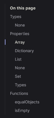
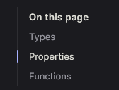
Whether to show members in the sidebar under their property type. This should be a boolean. Comparisons below:
 false:
Defaults to: false
gitSourceBranch
The source branch to use for source URLs. This should be a string.
Defaults to: master
includeChangelog
Whether to include a changelog on the site. This should be a boolean.
Defaults to: false
changelogOutline
The outline to use for the changelog. This should be a list of numbers, where each number is the depth of the heading to include in the outline. Alternatively, this can be a singular number.
Defaults to: [2, 3]
baseUrl
The suffix to add to the current URL for the docs. For example, if your docs are hosted at https://example.com/docs, this should be /docs. You also have to do this for GitHub pages.
Defaults to: /
readmeAsHome
Whether to use your project's README.md file as the home page. This will completely replace the home page with the contents of the README file. This should be a boolean.
Defaults to: false
gitRepoUrl
Your GitHub repository URL. This should be a string. If not specified, tries to find based on git config in directory.
Defaults to: null
VitePress
VitePress configuration options are defined under the vitepress key in the mdwave.toml file.
TIP
Paths to the site itself should be relative: if you want to link to a markdown file, use /path/to/file.md instead of {base_url}/path/to/file.md - MDWave will automatically add the base URL and take care of the routing. If you want to direct to external sites, use the full URL.
sidebar
Sidebar configuration options are directly passed to Vitepress. The format of a sidebar object is an object containing text, and optionally link or items. You can also pass collapsed, which is a boolean, to allow the group to collapse. While you generally won't be needing this option, as MDWave automatically generates the sidebar for each page based on user-specified options, you can use this option if needed.
INFO
MDWave will automatically overwrite the api and docs sidebars.
Example of use:
[vitepress.sidebar.api]
text = "API"
link = "api"
nav
Navbar configuration options are directly passed to Vitepress. The format of navbar buttons is simple: pass in a object containing text and link. Optionally, you can also pass in an items property to create a dropdown.
INFO
MDWave automatically creates an API navbar button if it doesn't exist already. It will be appended to the list of navbar buttons. It is not recommended to overwrite the API nav button, as it automatically links to the first page within the API, which cannot be done with a constant.
Example of use:
[[vitepress.nav]]
text = "Guide"
link = "docs/guide/intro"
socialLinks
Social link options are directly passed to Vitepress. The format of a social link is simple: pass a icon object and a link string.
TIP
The available icons are discord, facebook, github, instagram, linkedin, mastodon, slack, twitter or youtube. Alternatively, you can provide a object with svg as key and add your own icon.
By default, a GitHub social link is included. Example of use:
[[vitepress.socialLinks]]
icon = "twitter"
link = 'https://example.com'
features
Features are simple cards listed on the homepage. The format is an object with the keys text, details and optionally a link. By default, no features are included.
Example of use:
[[vitepress.features]]
title = "Feature"
details = "This library is absolutely amazing!"
link = "/docs/guide"
actions
An action is a button on the homepage. The format is a simple object containing a text and href, and optionally class, content. Class is the class to be assigned to the button. If you're unsure, look at the example config. There is a default class, but it has no colors, etc. Content is the content within the button. This is read as HTML and imported, and is primarily meant for i.e. custom icons.
By default, an "API Reference" and a "Getting Started" action are included. You can find them in the example config too, in case you need the icons or want to purely edit the links.
Example of use:
[[vitepress.actions]]
text = "API Reference"
href = "api_path"
class = "mx-1.5 border border-slate-400 bg-slate-300 text-slate-800 hover:bg-slate-400 dark:border-slate-700 dark:bg-slate-800 dark:text-slate-100 dark:hover:bg-slate-700"
INFO
Providing api_path as a href will automatically link to the first class in the API.
footer
The footer data is directly passed to Vitepress, which expects an object that can hold message and copyright as optional values. These values support HTML.
Example of use:
[vitepress.footer]
message = "This is a footer message"
Docs
TIP
In order to add custom doc pages, you have to add them into the docs folder on the root of your project. Subfolders are supported.
TIP
Docs rely heavily on "front matter". Front matter is, in our case, YAML data written on the top of markdown files between triple-dashed lines. It is used to specify options for almost all customizable parts of the docs.
While Vitepress supports JSON and YAML front matter, MDWave only supports YAML, so it's recommended to purely use YAML.
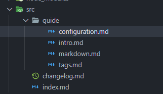
The vast majority of the customization options are focused on the sidebar. By default, MDWave generates a sidebar based on the file structure of your docs folder. For example, the following image: 
docs/, containing index and changelog, and docs/guide, containing all 4 files listed there. The order of these options is practically random though, which is not what we want. To fix this, the options listed below exist.
sidebarAliases
Sidebar aliases exist to change the text shown for a directory in the sidebar. By default, a path like docs/guide would get the title "Guide". However, you can change this to anything you want. The format is a simple object with the key being the path, and the value being the title.
Example of use:
[sidebarAliases]
guide = "Usage Guide"
group
The group front matter option is used to group pages together in the sidebar. The format is a simple string, which is the name of the group. By default, all files in a directory are grouped together. Providing a "group" will list it under a seperate category in the sidebar.
Also, you can nest groups by using a "/" in your group path, for example Usage/Examples. This will create a group called "Usage" with a subgroup called "Examples".
Example of use:
---
group: Usage
---
position
The position in the sidebar that this page will have. The default position is 0.
Example of use:
---
position: 1
---
title
The title of this page in the sidebar. The default title is the filename in TitleCase.
Example of use:
---
title: Usage Guide
---
isRoot
Whether to add this page as root. This should be a boolean. By adding as root, we mean replacing the title with a link to this page. This is useful if you have a parent page that contains several subpages. If you enable this, make sure to not add multiple pages to the same group. It will throw an error. Also, title is optional if this is set to true.
Example of use:
---
isRoot: true
---
API Reference Config
You can configure the sidebar layout of the API reference using the classSections config option. This allows you to configure the groups, nesting and order of the classes in the sidebar.
The format of the classSections option is a list of objects, where each object represents a group of classes. Each object should have a section and classes key, and optionally a collapse key.
The API Reference configuration allows you to assign data to classes, so they are organized properly. This is inherited from the Docs pages, and you can apply the tags via Moonwave.
group
The group tag is used to group pages together in the sidebar. The format is a simple string, which is the name of the group. By default, all files in a directory are grouped together. Providing a "group" will list it under a seperate category in the sidebar.
Also, you can nest groups by using a "/" in your group path, for example Usage/Examples. This will create a group called "Usage" with a subgroup called "Examples".
Example of use:
---@tag group Usage/Examplesposition
The position in the sidebar that this page will have. The default position is 0.
Example of use:
---@tag position 1title
The title of this page in the sidebar. The default title is the class name.
Example of use:
---@tag title Usage GuideisRoot
Whether to add this page as root. This should be a boolean. By adding as root, we mean replacing the title with a link to this page. This is useful if you have a parent page that contains several subpages. If you enable this, make sure to not add multiple pages to the same group. It will throw an error. Also, title is optional if this is set to true.
Example of use:
---@tag isRoot trueAppearance
We don't have any appearance options yet. For the time being, a good way to modify the theme is to fork the MDWave Repository and modify theme. This theme is directly copied over and is what makes up the site. Information on how to modify the theme can easily be found on the Vitepress Documentation.